Services
Branding & Design
Website Development|Content Management|
Choosing your colours
A company’s colours are at the epicentre of its identity. Having the right colour palette transforms you from a business into an authentic brand
Certain industries lean toward certain colourways. Health conscious businesses often use green - which explains why McDonalds switched to a green interior back in 2009. Tech firms prefer blue which signifies innovation and loyalty - think Facebook, Twitter, PayPal, Samsung, and every iPhone button ever. I’ll find a colour combination that represents both embodies your message and makes your brand stand out from the pack.

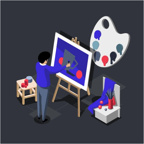
Choosing a website colour-palette involves further considerations. UI (user interface) designers draw from an extensive Color Theory when designing a prototype. I tend to work with only a small handful of highly saturated colours (like the purple and red here) so that they stand out whilst not overwhelming the user. When picking out these primary, secondary and tertiary colours, I test their compatibility using savvy tools like Contrast Grid.
Designing your logo
Where colours shape brand identity, a great logo shows that you are a professional within your space
The goal is to create a logo that represents the industry and distinguishes you within that industry. Firstly I’ll study your target market and look into the approach of established competitors. Then I’ll work on that distinguishing element - at this point it is crucial that you convey how you perceive your service and how your customers already perceive it. Once that core idea is down, a combination of font style, text and imagery will emerge naturally.
Taste around logo styles does change through the years - the one constant being that a simple logo is a timeless one. Graphics should be smooth, eye-catching and uncomplicated, and usually 1-3 colours is plenty - take Apple or Nike as the benchmark.
![]()
Using Adobe Illustrator, I vectorise my logos so that they can be shrunk or blown up to any size without losing quality. Oftentimes, you’ll need a few variations - my logo packages come with a handful of options so that you’re covered on all bases from websites to business cards.
Designing your website
My websites generally follow a structure that guides users towards interacting with you. Your landing page (usually “home”) is the pièce de résistance - it will ease the user into your services using digestible snippets of information in an eye-catching way. The content pages that follow should lead smoothly towards a call-to-action - usually a “contact”, “book now” or “sign up” page.
I’ll draw on UX/UI principles when creating your site’s wireframe. I touched briefly on how colour contrast can be used to guide the user - and there are many more techniques at hand - visual-hierarchy; accessibility and consistency are all considered in my design process.
As you’ll learn in the following section, the developer tools I use are state-of-the-art because they have UX/UI design principles in mind. For instance, I style elements using Tailwind, which follows a mobile-first approach. This makes it easier for developers to keep a website’s style consistent across all devices - crucial.
More services
